Omicron Was Never Mild
There is a limit to the speed at which things can be known in a pandemic — omicron was never mild.

Calling the Omicron variant “mild” was an unforced error that an understanding of lagged time series would have prevented.
Omicron appeared in the last week of November. By the week of December 20th, two studies were published reporting that Omicron was less likely to result in severe outcomes. One reported it was 2/3 less likely; the other, 80% less likely.
With that, the narrative of “mild” Omicron was born. The “good news” spread rapidly and the legend grew: Covid was evolving to be less deadly — a natural step that all pandemic illnesses eventually take. Endemicy, the Tweets declared, was right around the corner.
To be clear every one of these statements was false then and still is now. Omicron is not mild. Viruses do not need to evolve to be less deadly. And endemicity has nothing to do with mildness.
Still, social media was awash in the news and conventional media was eager to put a mic on anyone willing to tell us more.
To my knowledge, the studies referenced above did not explicitly call Omicron mild. Instead they dryly reported outcome statistics. The word mild came many seconds later propagated by generously-platformed social media users.
Those who were doing the Tweeting about Omicron being mild likely did not intend or foresee the consequence. After all, Twitter’s character limit forces concision and ‘mild’ is a character-efficient way to say an awful lot. It was convenience not maliciousness. Trouble is, “mild” is a nonspecific word that everyone quickly assigned their own prejudicial notion. It was easy to burrow deeper into confirmation bias.
But the careless use of the word mild to describe Omicron — which was probably the only thing on Earth that spread faster than the new variant itself — was not the only flaw with the narrative. It was impossible on December 22 to gauge the outcomes of a virus that had not yet been known for 4 weeks.
We know now that that infection with Omicron is about half as likely to cause death compared to Delta (less than the 67–80% reduction reported in the original “mild” article). But much of that reduction is the product of immunity derived from vaccination or prior infection. The unvaccinated are enduring the worst outcomes at rates barely less than prior variant waves. So are children, who are disproportionately unvaccinated. Delayed and persistent cognitive effects and vascular events are occurring at a higher rate than ever before. The narrative of mild Omicron is being rebutted in medical journals, and in The Atlantic, and on social media by the same people who rushed to be “first-to-tweet” about its mildness. It will be a long time before we know how much disability Omicron will cause in our population. Not mild by any meaningful definition — and already brutal on the scale of worlds — Omicron has not even done its worst. Cases may have peaked in many places but deaths and hospitalizations are just getting into position and BA.2 is waiting in the wings.
This article is about time…and lags: specifically the speed of causality in a pandemic. How quickly is it possible to know something about any new variant? When the first study came out on December 22 calling Omicron mild there was no way that what it reported to show could be known yet. It was impossible for that information to be present in the signal. Knowing that, I Tweeted my objection to my 50 followers on Twitter. It didn't change anything of course.
The damage caused by early reports of “mild” Omicron was exerted through its subsequent influence on both individual human behavior and public policy.
This is not intended to be a scholarly article, Medium is not the forum for that. It is an opinion piece. It concerns the speed limit of knowledge of causality during a pandemic. It is intended for a diverse audience — there is something here for doctors, epidemiologists, and everyone else. I apologize that it ends rather anticlimactically — I had bigger plans for the end but it already goes on much longer than I intended.
This article is divided into 8 sections summarized below. In italics is the central point of each section. Although there is no math anywhere in this paper some of it gets pretty dense. Feel free to skip any sections but the point I summarize in italics is essential to the final conclusion.
- The importance of finding the correct lag: Early in a pandemic wave while cases and deaths are still rising, using too short a lag to determine the CFR results in underestimation of the case fatality rate.
- What should be meant by a “wave” and the fatality rate of a wave? Any attempt to discover the lag early in a wave while we are still on the upslope results in determining a lag that is shorter than the actual lag.
- Time from diagnosis to death: the effect of randomness: Randomness distorts the time series for deaths. But even though the shape of the time series is altered, the area under the curve for deaths must be the same with distortion as it was without distortion. The presence of randomness in the time from diagnosis to death and the requirement of causality necessarily lowers the peak, broadens the base, and moves some of the curve’s “mass” to the back side (post-peak side) of the deaths curve. Since that mass is on the back side of the curve, it cannot be detected early.
- Distortion in South Africa’s second wave: Demontrating the point made in (2) for South Africa specifically: attempting to discover the lag early in a pandemic wave while we are still on the upslope results in determining a lag that is shorter than the actual lag.
- Omicron’s actual lag: The delay from diagnosis to death with Omicron is about 10 days longer than with prior waves. Only South Africa data has emerged from the noise. But other countries and cities will start to become clear soon.
- Final Thoughts: Stop calling things mild. This is a pandemic. Pandemics are bad. This one is no different. How bad? We’ll know when it’s over, not before.
- Appendix A: A Primer on Cross Correlation
- Appendix B: Subnational cross correlation around the world
A Few Basic Ideas and Conventions Used in the Rest of the Paper
A time series is an ordered sequence of values having some relationship to time: the daily average temperature in Albuquerque, annual snowfall in Saskatoon, the number of people passing through Grand Central Terminal each week. In our current predicament, the relevant time series are the number of daily Covid cases and deaths. Lagged time series are ones in which one time series is delayed behind the other often due to a causal relationship. Monthly desert rainfall, vegetation growth, and rodent population are examples of lagged time series: first it rains, then plants grow, then rodents convert the new resources into offspring. So too, Covid deaths lag behind Covid cases.
The figure below shows almost 2 years of the Covid pandemic trajectory in South Africa from February 1, 2020 through January 21, 2022.
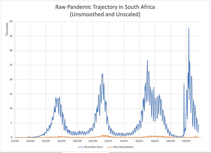
I will use it to highlight some basic ideas and introduce a few conventions that will appear throughtout the rest of the paper. New Covid diagnoses are plotted in blue; deaths, in orange. South Africa has experienced 4 waves of the pandemic. It is difficult to discern much else from this unsmoothed, unscaled data. Reporting artifacts due to mankind’s division of time into 5 workdays and 2 weekend days creates a cyclic artifact with a period of 7 days which occurs in the time series for both ‘cases’ and ‘deaths’. This fact, combined with the roughly 50-fold difference in scale between the time series obscures anything else. But if we smooth and rescale the data, a lag between case diagnosis and death is easily appreciated.

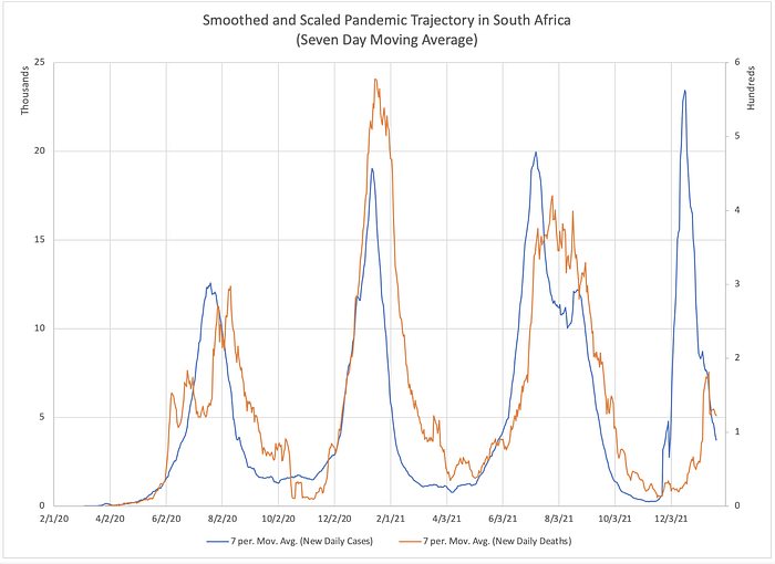
Here, both time series have been smoothed using a moving seven day average. The lag between the cases (blue) and deaths (orange) is now qualitatively apparent. Still, how should we measure that lag if we wish to quantify it? It might be tempting to compare the peaks of each wave and measure the difference in timing between the peak ‘cases’ and peak ‘deaths’ for each wave. But doing so stakes the entire alignment on a single point — the peak. If the location of that single fiducial point is corrupted by noise or distortion (we will see later that it necessarily is), there are no other points being used to correct the alignment. Wouldn’t it be better if we could somehow correlate multiple features of each time series instead of just one? Enter cross correlation.
Cross correlation is a mathematical technique from the field of stochastic (random) signal processing. It is used to find the delay between two lagged time series. Some examples of its application include audio engineering, image processing, radar, and sonar.
The Importance of Finding the Correct Lag
In our current predicament, one of the things we often wish to know is how often a diagnosis of Covid results in death. One clinical way of doing that using standard clinical research methodology would be to follow a subset of people diagnosed with Covid for a prespecified period of time and count how many of them died. For example, if 10,000 people were diagnosed with Covid on December 1, 2021 you might follow a random sample of 1,000 of them for 28 days. At the end of your follow up period you would divide the number who died by 1000 and report your results for the death rate on December 29. You would apply the standard statistical methods to determine the confidence interval on your measurement which results from the fact that your sample did not include the entire population.
But what if you chose a follow up period that was too short? What if the mean time from diagnosis to death were 30 days? In that case, more than half of deaths would have occurred after your study concluded at 28 days. The mortality rate you calculate would be too low.
Another method you might use could be to divide all of the deaths that occurred today by the number of cases that occurred at some point in the past. If you knew what the average time from diagnosis to death was, you could divide today’s deaths by the number of diagnoses that occurred an appropriate number of days in the past.
Imagine that observation of 3 prior waves of the pandemic had determined a mean lag from diagnosis to death of 22 days. You wish to estimate the case fatality rate (cfr) of the current wave. Now suppose you assume that the previously-determined lag of 22 days still applies to this wave. On December 23rd you divide the number of deaths that day by the number of case diagnoses on December 1. But again, what if you chose the wrong lag? What if you should have compared today’s deaths to the cases that were diagnosed 30 days prior? Or 16?
Let’s explore the consequences of assuming too short a lag. Using Microsoft Excel I constructed sample curves for cases and for deaths. For the “cases” signal, I made a triangle wave rising linearly from zero daily cases to 10,000 daily cases over a span of 20 days. Then it falls off linearly back down to zero cases.
I made the “deaths” signal by supposing that 30% of everyone who is diagnosed dies exactly 30 days after diagnosis. (In a later section we will explore what happens when not everyone dies exactly the same amount of time after diagnosis but rather follows some probability distribution).
Here is what those two signals look like.
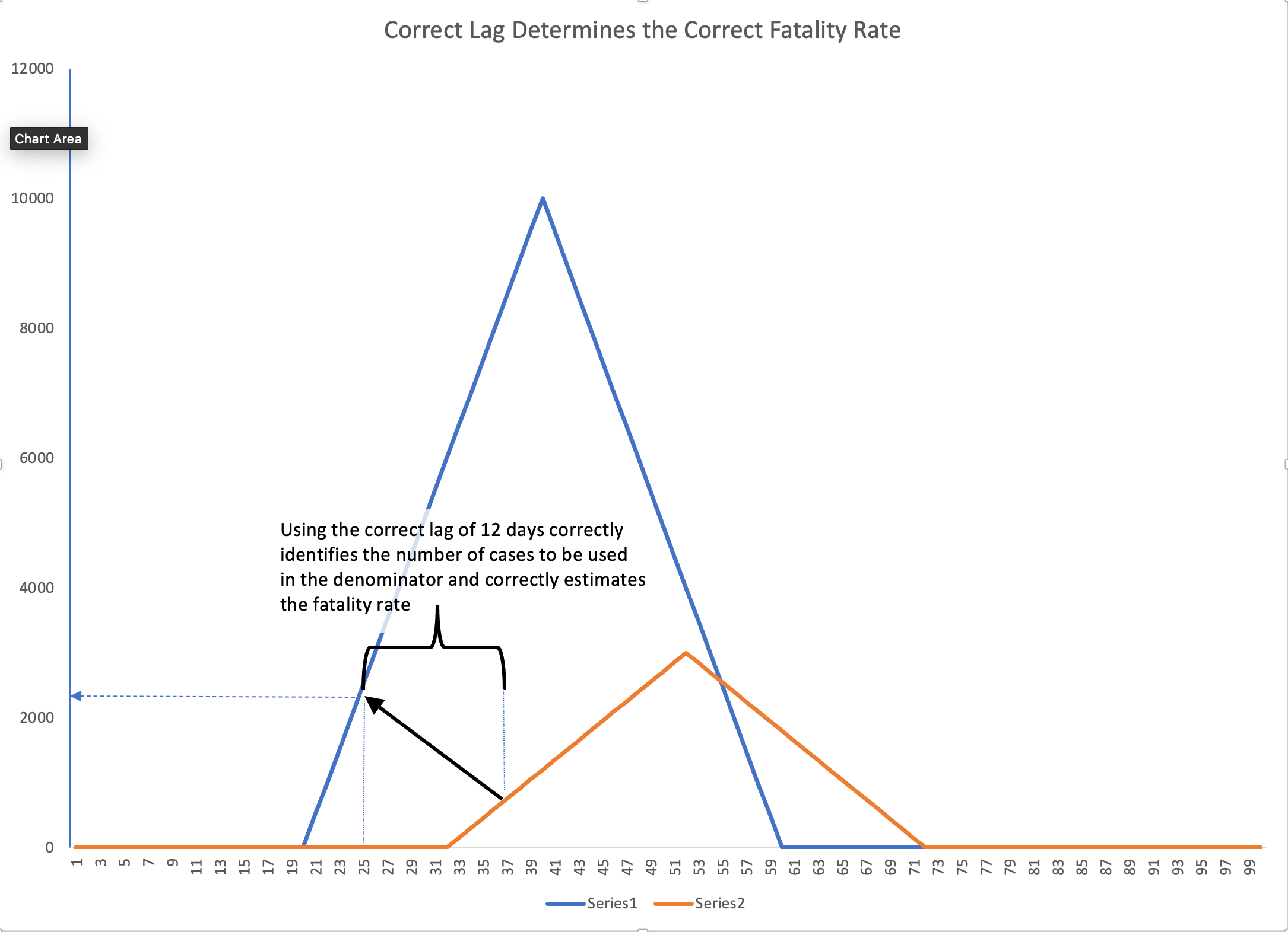
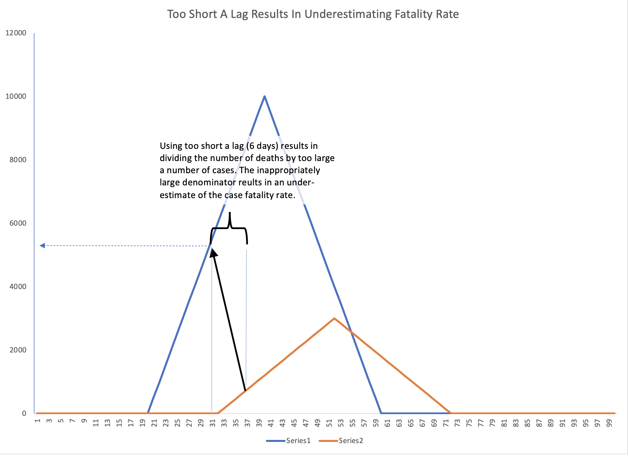
Begin with the figure on the left. Imagine that on day 37 you decide to calculate the CFR by dividing the number of deaths on day 37 by the number of cases that occurred at some earlier date. On day 37, there were ~700 deaths. Suppose you estimated a lag of 12 days. You you would go back to day 25 and look to see how many diagnoses occurred that day. In this case, that number was ~2,100. Next divide the number of deaths on day 37 (700) by the number of cases on day 25 (2,100). The CFR you determine is 33% which is very close to the value of 30% programmed for this example.
But now imagine you assumed the lag was only 6 days. This is the situation represented in the figure on the right. On day 37 there were still the same 700 deaths. When you go back 6 days to day 31 you find that there were 5,300 cases. Now, when you divide the deaths on day 37 by the cases on day 31, you would conclude that the case fatality rate is 13%, a rate that is much too low. This is a general result: early in a pandemic wave while cases and deaths are still rising, using too short a lag to determine the CFR results in underestimation of the case fatality rate.
I will leave it to the interested reader to explore what happens if you use too long a lag. You may also explore the effects of too long and too short a delay on the downslope of a wave.
What Should Be Meant By A “Wave” and the Fatality Rate of a Wave?
When this pandemic is long over, the final case fatality rate for Covid will be reported by future historians as the total deaths divided by the total cases between the pandemic’s beginning and its end. Let us then define the fatality rate of a wave to be the area under the graph of deaths divided by the area under the graph of cases — the orange area divided by the blue area in the figure below (much of these two areas overlap). We might wonder whether or not that final value is knowable at any earlier time before the wave has ended— before the peak, for instance.

Let’s now be a bit more rigorous about what we should mean when we talk about a ‘wave’ of a pandemic. You probably have some intuition about what that means. If I gave the following graph to group of people and asked them all to circle each ‘wave’, epidemiologists, senators, and 5th graders alike would probably all come up with the same answer.
But if we are going to start performing calculations on this data, we need a more concrete notion of a wave.
Recently, a team performed an analysis describing the shape of an average Covid wave. They lined up a bunch of waves of the pandemic from different cities and combined them to form a prototypical, ‘average’ wave. They used this picture of an average wave to make observations and draw conclusions about the ‘up and down’ dynamics of a wave. To do this, they needed to define what constitutes the beginning and end of a wave.
To do so, they borrowed from signal processing. They defined a wave as starting when the 7 day moving average rises above 1/2 of the wave’s eventual peak value. The wave’s end was defined as happening when the 7 day moving average dropped below that same value on the back side.
Allowing for some license-taking , this idea borrows from a standard used in signal processing and filtering known as the -3dB point (minus three decibel point). I like the general principle of this definition but it has a couple of limitations for our purposes. For one thing, you have to know what the peak is before you can define the start point which means you cannot use this method to identify the start of a wave in real time as it unfolds. You can only identify the wave’s start in retrospect.
Another issue is that cutting off each end of a wave at the halfway point excludes a lot of the wave’s mass, mass we probably want to include in our analysis. This is shown in the figure below.
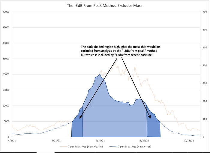
We can fix these limitations with two modifications. If we want to identify a new wave in real time as it begins we need a different reference. Therefore, for the purpose of the following discussion, I will define the start of a wave as the point in time when the average power doubles compared to the preceding minimum (instead of when it is half of the upcoming peak). This allows us to identify a wave as it begins.
For the Covid wave in South Africa immediately preceding Omicron this looks like the figure below.

The third thing to notice is the delay between deaths and cases. The fact that a delay exists is expected as we have discussed. But perhaps unexpected is that the delay at the end is longer than the delay at the start. In other words the delay from the end of the wave of cases to the end of the wave of deaths is longer than the delay from the start of the wave of cases to the start of wave of deaths. That is way too complicated a sentence for a very simple idea so here’s a picture worth all the words.

This observation results from the fact that not everyone destined to die in a wave will do so after exactly a certain specified time following diagnosis. That is, if 10% of people diagnosed with Covid are destined to die and if everyone who dies does so exactly 20 days after diagnosis then we would expect the time series for deaths to match the time series for cases exactly. It would be shifted to the right by 20 days and shrunk down vertically by a factor of 10 but its contours would match the graph for cases curve-for-curve.
But deaths do not follow diagnoses by an exact delay. If the average time from diagnosis to death is 20 days, some people die after 5 days, others after 30 days, etc. — we expect there to be some statistical distribution of diagnosis-to-death times. This causes the time series for deaths to be distorted relative to the time series for ‘cases’. It also shifts mass of the ‘deaths’ time series to the back side of the series, after the peak. If you found that hard to understand, don’t worry, we will explore it further in the next section.
“Time From Diagnosis to Death”: The Effect of Randomness
Not everyone who is destined to die of Covid will experience the exact same delay from diagnosis to death. Some people may die a few days after diagnosis while others may live for several weeks before succumbing to their illness.
Let us perform a thought experiment. Imagine a hypothetical illness where everyone who gets sick (in this case 10,000 people), gets sick on the exact same day. After that, no one else ever gets sick again.
Now let’s imagine that the fatality rate is 30% and the delay from diagnosis to death is exactly 10 days with no variation. This means that 10 days after 10,000 people become sickened 3,000 people die. Those graphs would look like this:

Now let’s relax the assumption that all cases occurred on the same day. Instead let’s have the same 10,000 people get sick but they get sick spread out across 10 days instead of all at once. Death still occurs exactly 10 days after diagnosis in all cases.
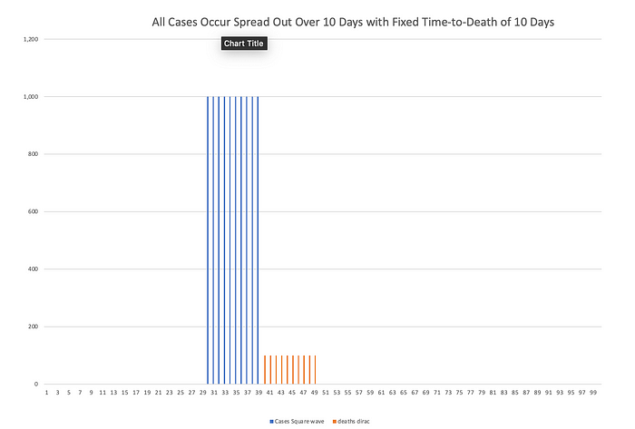
Now imagine that instead of a fixed 10-day time to death for everybody, some people die after 5 days, other after 6 days, 7 days, 8 days, etc. The fatality rate is still 30% so 3,000 people die in total. But those deaths are now spread out. If the time-to-death is uniformly distributed — say 3% chance of death each day from day 5 to day 14 — then 300 people die each day.
Let’s go back to the simplifying assumption that all 10,000 people are diagnosed on the same day. That graph looks like this.

The effect of introducing this randomness is that the deaths arising from 10,000 simultaneous cases have been “smeared out” over time. Next, imagine that diagnoses once again occur over 10 days and the time to death follows a uniform probability distribution from day 5 to day 14.
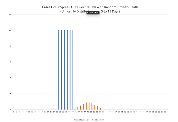
Here is what those graphs look like. I want to point out a few things about this plot. First, the time series for deaths has a much broader base than the time series for cases. Second, it does not follow the same “jump” up to its peak value and then “jump” back down to 0 that the time series for cases has. Instead it rises gradually (linearly) and then returns to baseline gradually (also linearly). The effect of this randomness in the time-to-death is to make it so that the two cases series no longer have matching contours. This is called “distortion”.
In this case, it is a straightforward exercise to show that the distortion imposed by this randomness has the properties of a causal low-pass filter. (Technical aside: Those of you who have studied differential equations and probability theory will recognize the content of this section as reflecting the transformation of a random variable and the convolution integral — or more accurately, the discrete convolution sum. An interested reader can learn more in an undergraduate textbook on differential equations and probabilistic methods in signal processing. Two semesters of college calculus are probably required.)
Here is the point of all of this. The area under the curve for deaths must be the same with distortion as it was without distortion. The combination of low-pass filtering and the requirement of causality necessarily lowers the peak, broadens the base, and moves “mass” to the back side (post-peak side) of the deaths curve. The source of this distortion is the randomness that occurs in the different amounts of time from diagnosis to death (ie. that not everyone dies exactly the same number of days after diagnosis.
Real pandemic waves have upslopes that follow an exponential growth formula and down slopes that are roughly more linear decay. The probability distribution is more likely to be roughly Gaussian. In our thought experiment, it would lead to something like this:
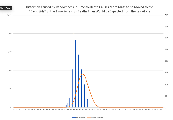
Technical aside: a reader has pointed out to me that there is an error in the scale of a few of the figures above in this section. This is my mistake due to a referencing error I made when creating this example. I will update the affected figures later today. My thanks for such careful reading.
Distortion In South Africa’s Second Wave
Now let’s look at this distortion in the actual time series from South Africa. Here, I have excerpted South Africa’s second wave (smoothed). You can see how cases diagnosed one day lead to deaths along a swath of the time series for deaths.

But now let’s do the same analysis in reverse. Let’s look at all the deaths that occur one day and examine when those diagnoses occurred.
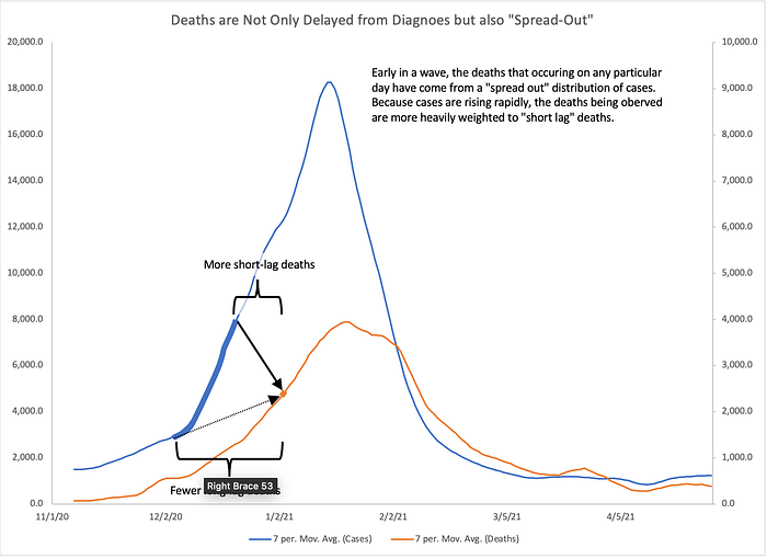
Here you can see that the deaths that happened on January 5, 2021 resulted from diagnoses that were made between December 8, 2020 and December 29, 2020. But since we are on the upslope of the wave, there were many more total diagnoses made on December 29th than were made on December 8th.
Therefore, even if short lags of 13 days are much less likely than 23 day lags, there were so many more of those diagnoses made that they people with a 13 day lag from diagnosis to death make up a misleadingly large fraction of the deaths occuring that day. Therefore, attempting to discover the lag early in a pandemic wave while we are still on the upslope results in determining a lag that is shorter than the actual lag.
Omicron’s Actual Lag
We are finally ready to look at the cross correlation of the Omicron wave in South Africa. First a few notes on terminology. I am calling the most recent wave in South Africa the “Omicron” wave. I recognize that (at least initially) this wave was part Omicron and part Delta. I also recognize that the relative contributions of one variant versus the other changed over time during this wave. I also recognize that those relative contributions differ not only over time but also from place to place around the world. This analysis is not about the intrinsic virulence of a viral variant but the aggregate impact on the population — with respect to a single outcome of interest — of all infections during a period of time, irrespective of what viruses may be circulating. After all, when you make a decision to go out — with or without a mask, having been or not been vaccinated — you do not know which variant or what mixture of variants you are destined to encounter.
This method is as blind to that fact as we are, considering only the entire weighted aggregate of all possibilities. In that sense, this method far more accurately reflects the situation we encounter in our real-world decision-making.
I am presenting only one geographical area, South Africa. It is the only region whose cross correlation signal as of January 21, 2022 was satisfactory for drawing conclusions.
The date cutoffs chosen for these two waves include the “baseline +3dB” start and stop points described above plus several days of “extra” data points we call “handles”. In the case of the Omicron wave, the end point has not occurred yet for either series.
The dataset I used is the WHO data set. I smoothed the time series using a 7 day average which is in common usage. A 7 day average is not the best filter for this purpose but it is easy to implement in Excel and allows anyone who wants to to reproduce and validate the smoothed time series. It is a 7 day lagging window (causal filter).
A technical aside. Even though cross correlation can be performed on the raw (unsmoothed) time series, doing so results in strong peaks with cycle 7 periodicity (0 lag, 7 day lag, 14 day lag, 21 day lag, etc.). This makes the cross correlation impossible to read. The moving 7 day average acts as a down-sampling-by-7 followed by up-sampling-by-7 operation. If someone wants to repeat this analysis using a better smoothing method I would suggest a Hamming or Hanning window or even LOESS regression. I would expect the later to yield the best results for this data with considerable nonlinearities but is much more cumbersome to implement.
Finally, this writeup has taken a very long time. I am hoping that it will be posted January 23, 2022. The cross correlation signal first became tenable on January 21st. By this morning (23rd) there was already considerable chatter about Omicron not showing nearly the reduction in mortality that we thought. Already an new variant is being monitored. Every day I delay risks irrelevancy.

Above, the four waves of Covid in South Africa. In gray are the two waves being compared, the Omicron wave and the most recent pre-omicron wave.
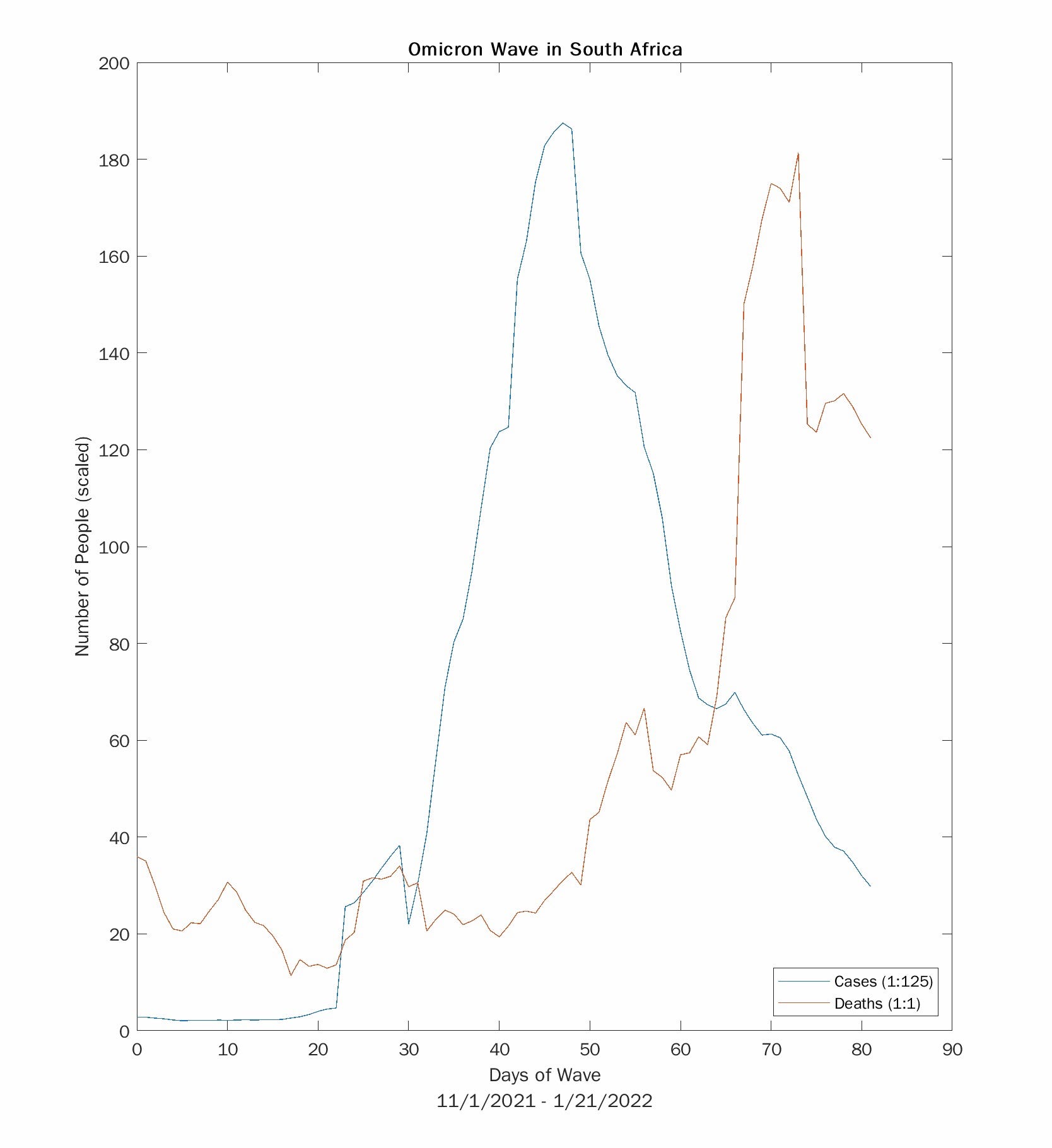
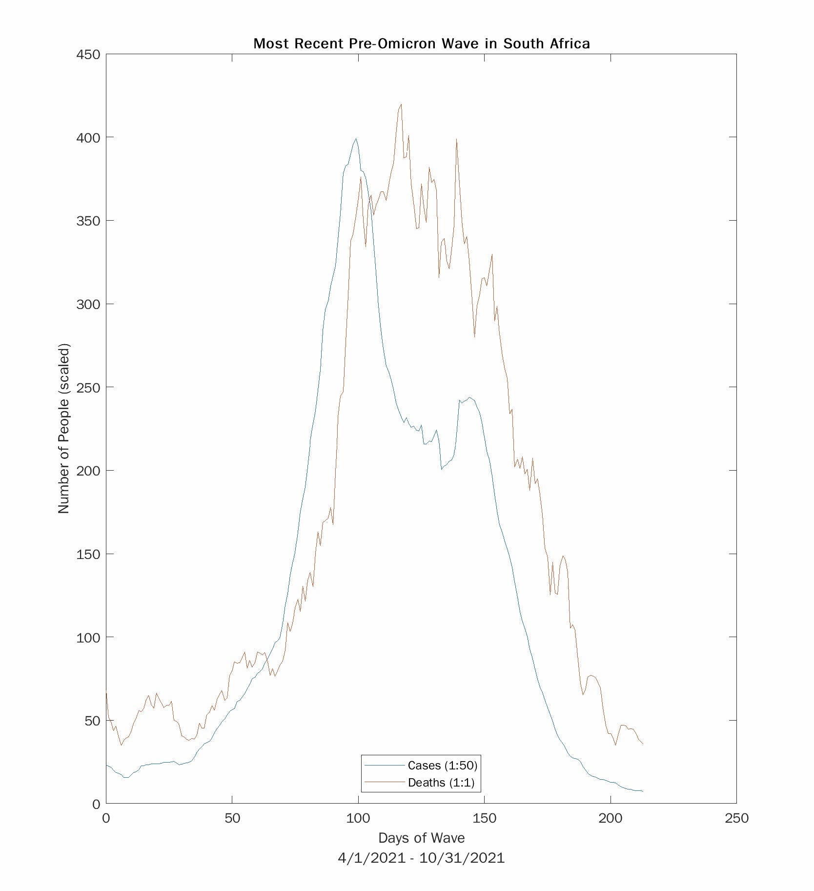
Above are the time series for the two waves being analyzed. Each wave has been isolated from the full time series.
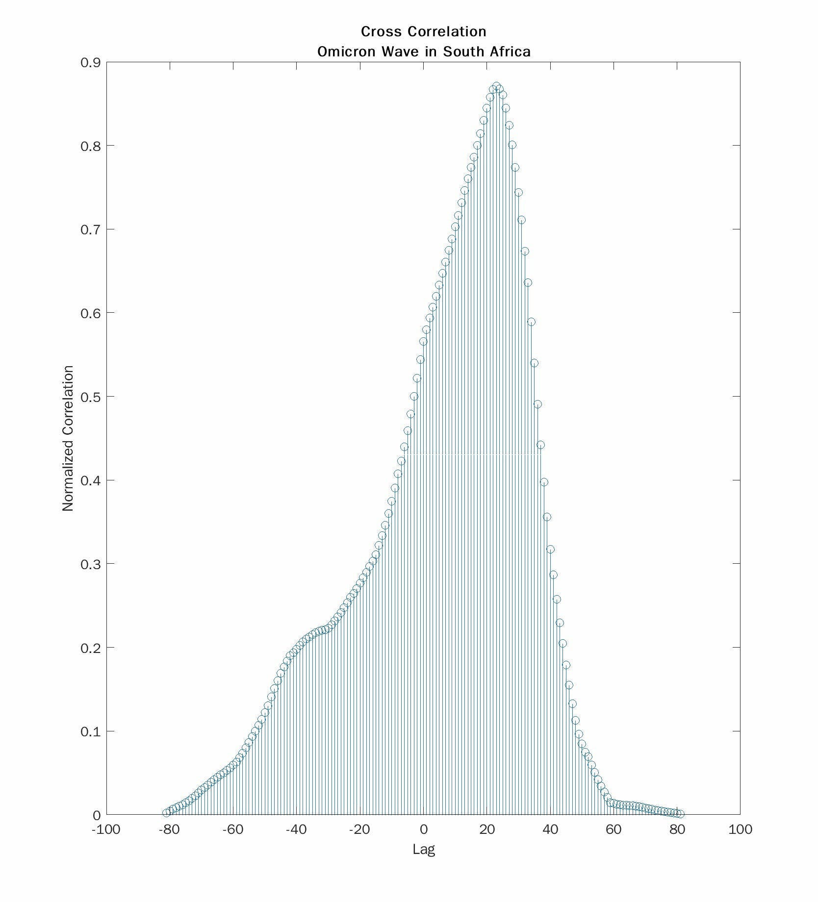
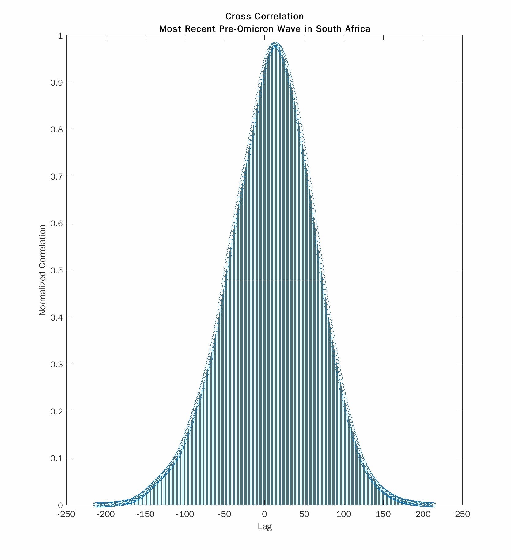
Here we see the cross correlations for the Omicron wave (left) and the most recent pre-Omicron wave (right). The absolute values of the lag at the peak correlation are 23 days and 13 days respectively. So death during the Omicron wave occurs about 10 days later than with the prior wave. But 23 days is close to the 22 day lag that Trevor Bedford reported with the summer 2020 wave. And 13 days is much shorter. I don’t have an explanation for that observation. Still the lag for the current wave is much longer than for the one that most recently preceded it.
I want to draw your attention to another feature of the cross correlation. The plot on the right is smooth and symmetrical. The one on the left is asymmetrical and has a weird “hump”. This comes from the fact that the time series for deaths is “chopped off” in the Omicron wave because it has not yet finished its return to baseline. I have already shown that stopping your time series too soon biases the results to concluding too short a lag. Waiting longer to collect more data with always result in lengthening the delay. With more time, the true lag may turn out to be a few days longer.
One way to deal with this is to make guesses about the missing “chopped off” values. Doing so runs the risk of injecting confirmation bias into your conclusions. I made the conscious decision not to catenate the truncated time series with “guessed” data.
Finally, lets use the lag we determined to compute a case fatality rate. This is shown in the figure below.
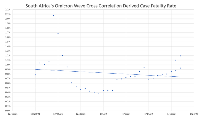
Here, I divided the deaths each day from December 20, 2021 through January 21, 2022 by the case numbers 23 days prior and calculated a regression. We expect that line to have very little slope which is the case. I make note of a couple of outlier data points which occurred in the vicinity of Chritmas and may be due to clerical artifacts stemming from holiday time-off. We get a result that the CFR is about 0.75%–0.9% which is 50% less than that of the prior wave (but not the 67–80% reduction of early reports) and is close to what I guessed at in my piece from December 31, 2021 (45% reduction).
Final Thoughts
It is natural to want to know how bad a new wave will be when it starts. But that is impossible to know before the main mass of the wave has passed. To confidently assess the rate of occurrence of severe outcomes such as death the peak of cases must have long-since passed. Most people destined to die will either already have died or already have had the exposure destined to result in death. For this reason, we should never make personal or policy decisions based on anyone’s assessment of a wave’s severity before that wave is almost over. If anyone asks me at the start of the next wave, “How bad does this one look?” I plan to say, “It’s too soon to say. I’ll tell you when it’s over.”
APPENDIX A: A Primer On Cross Correlation
This section will make use of the following arbitrary signal I made-up for illustration purposes.
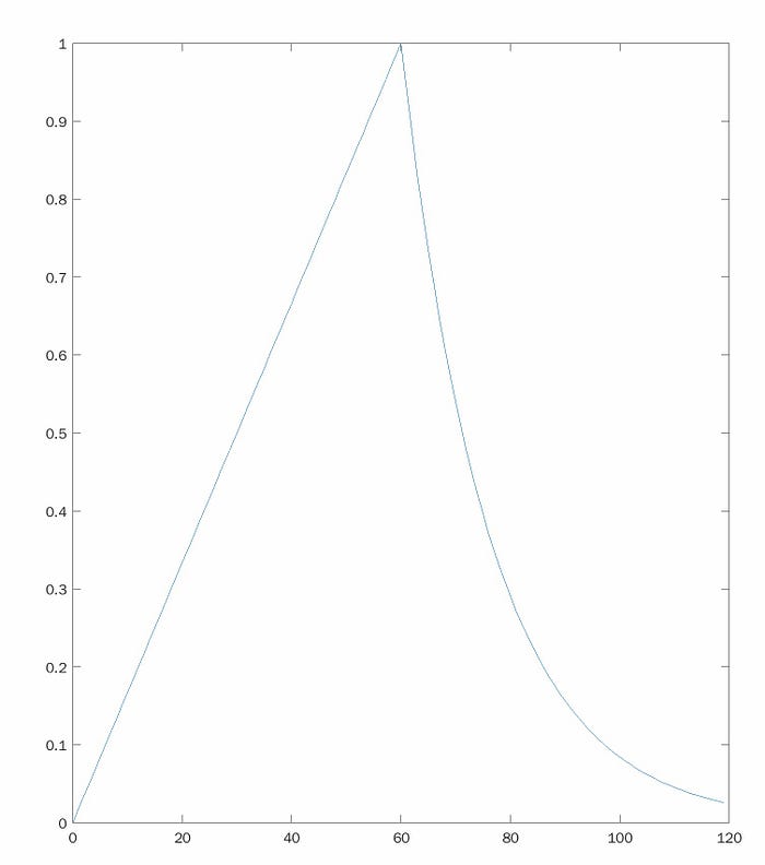
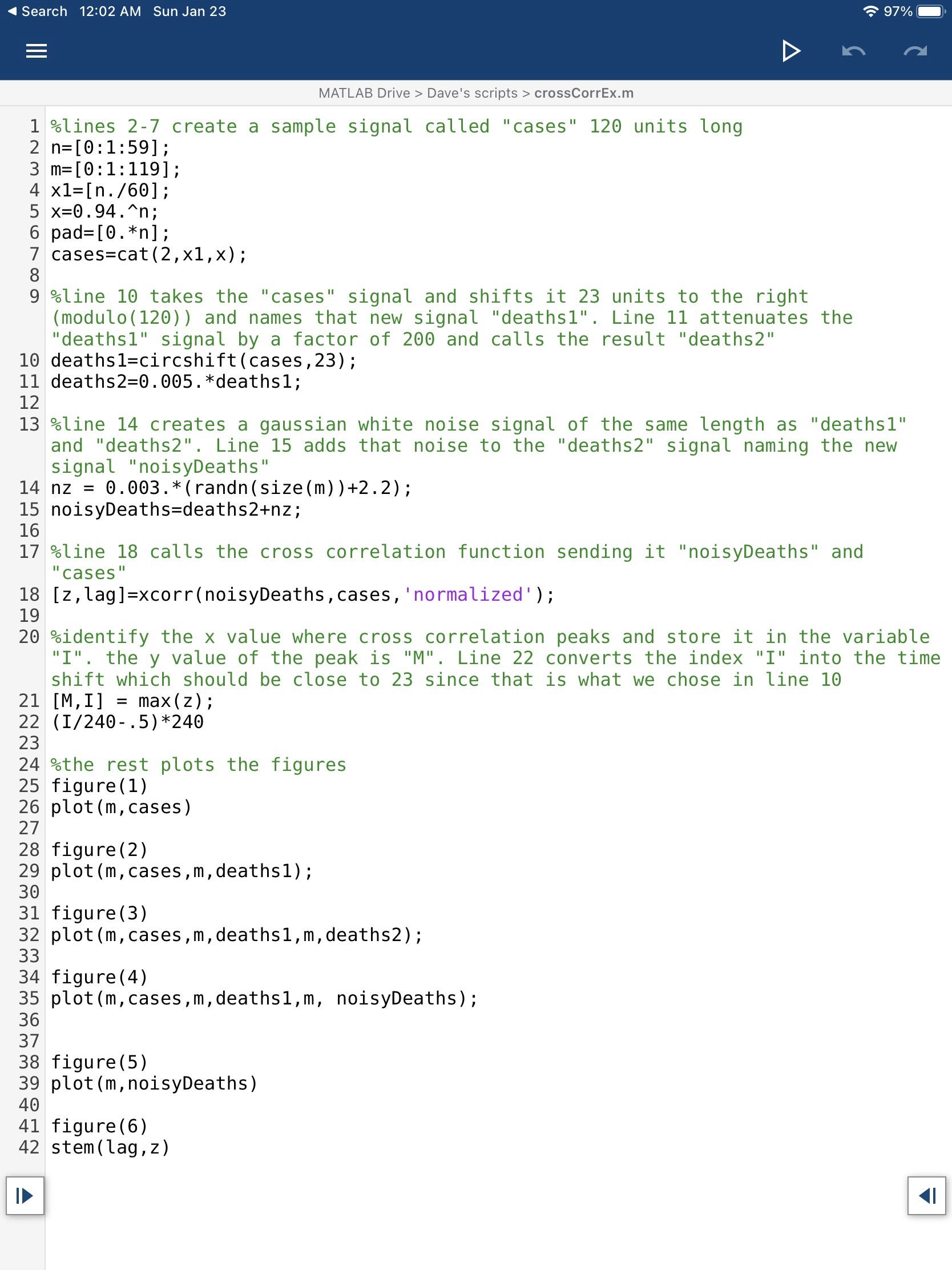
This signal rises linearly and then decays exponentially. In this example we will try to find this signal hidden within another signal. Specifically, we are going to take this signal, delay it by 23 units, shrink it by a factor of 200, and add a TON of noise. Then we are going to use cross correlation to find the original buried it in that whole mess. Those steps are illustrated below:
- delay
- attenuate
- add noise

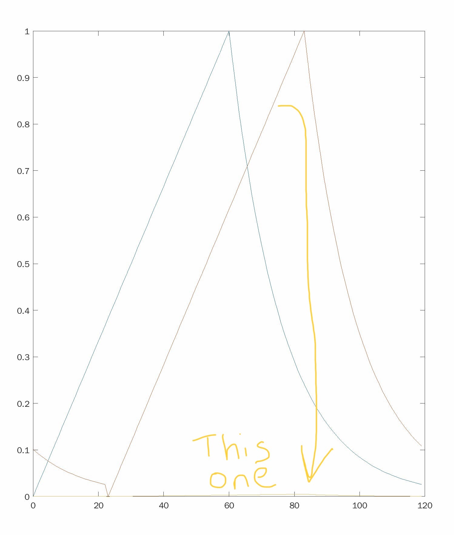
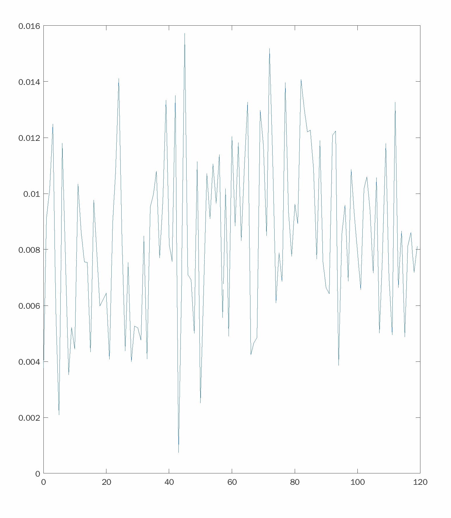
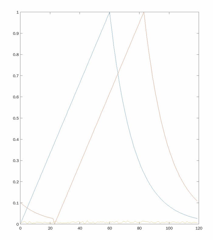
The noisy signal in yellow way down at the bottom of the figure is our final signal. Next, let’s use cross correlation to find our original blue signal buried in that.
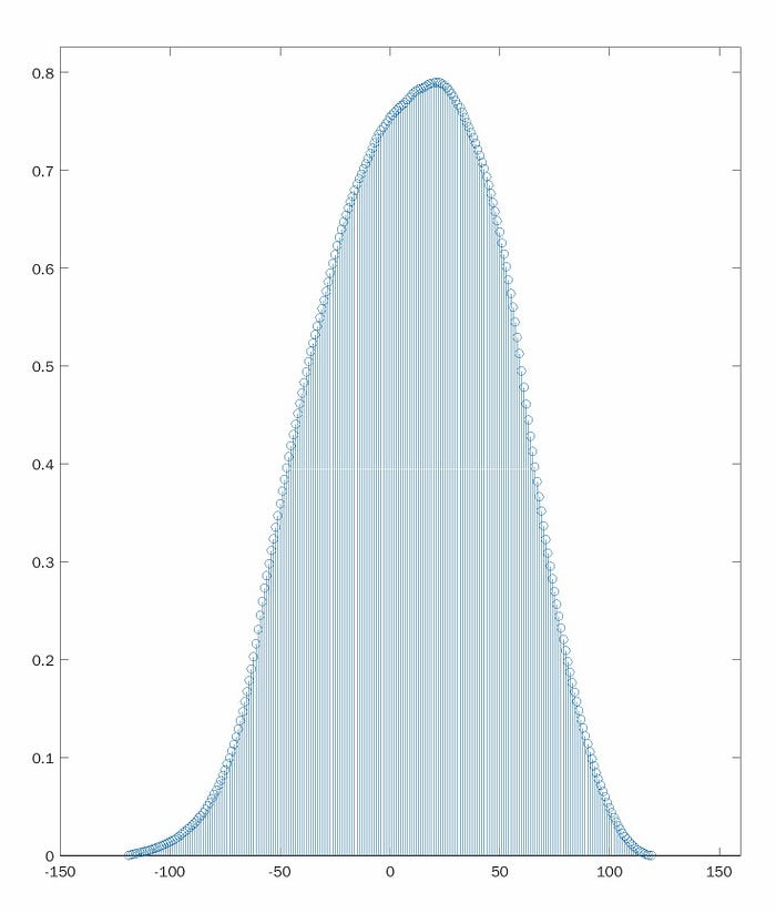
This is the output of cross correlation. The x-axis represents the lag between the two signals being cross correlated. The height along the y-axis represents the value of the correlation at each value of lag. The peak of the plot represents the lag at which the two signals are best correlated. Here, that lag (x-value where the graph peaks) turned out to be 22, very close to the value of 23 I programmed for this example.
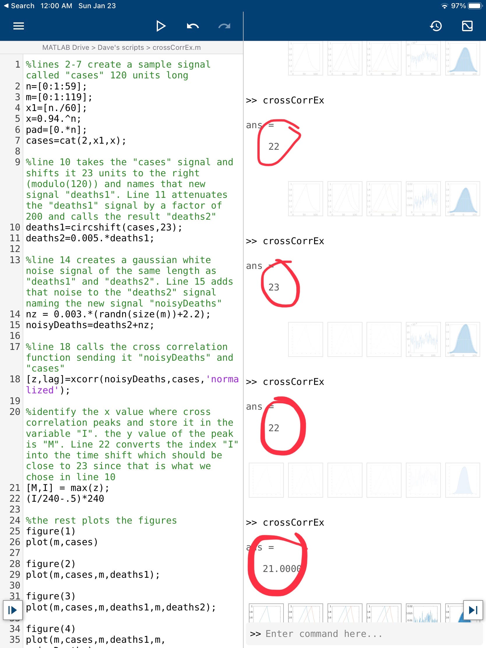
It is difficult to read the x-axis value off the plot so I included a line in the code to explicitly display that lag. The next two figures show the code of the MATLAB script that generated all of these figures as well as the lag values derived from 4 consecutive runs of the script. The programmed lag in each case was 23. These four consecutive runs resulted in finding lag values of 22, 23, 22, and 21 respectively.
APPENDIX B: What is subnational cross correlation showing in other countries around the world and in the United States?
It’s too soon to say. I’ll tell you when it’s over. I will not quote any measure of severity but only a lag that is in reason. All of these signals are too noisy to draw any conclusions. Nothing in this section should be quoted or attributed to me. The error bars here are HUGE.
Spain: maybe 30d lag
Germany: Unknown
Israel: this one’s getting close, maybe 22d lag
United States: The US is a large country whose various cities are experiencing the Omicron surge out of phase. So you have to look at subnational scale data
NY: still early but consistent with 30 day lag.
RI consistent with 29.
NJ: consistent with 27d.
FL: reporting delays cause distortions that no technique can penetrate.
CA: Consistent with 31d.
IL: Poor SNR but maybe 19d.
PA: too soon to tell but AT LEAST 27d.